
Google Correlate and S-Curves
S-Curves are awesome. They’re ultra-reliable. They’re among the best tools in social analytics that you’re not using.
They’re not really accessible. The math is particularly ugly/beautiful.
That’s why I’m excited about Google correlates draw function:
Anybody can draw this super powerful curve and explore.
Check it out.
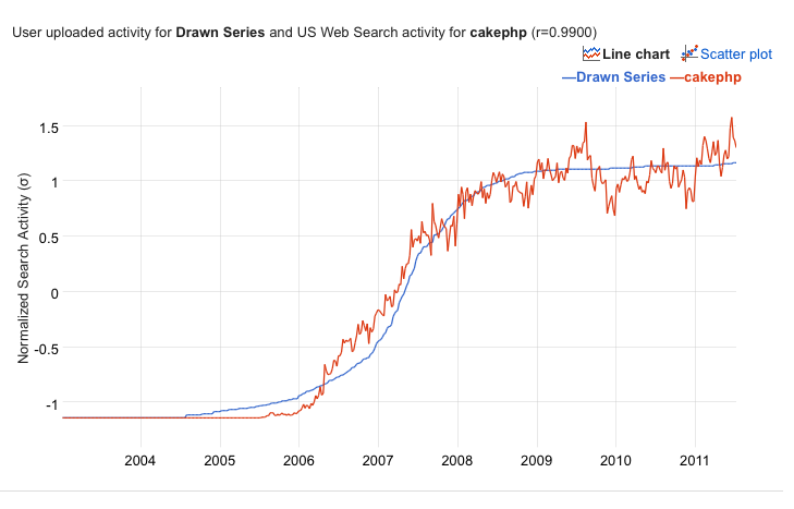
The first step is to draw an S-Curve. I drew one below. I’m looking for a technology that took a few years to remain in innovator mode, had hyper growth begin in 2007, and then took about a year to reach saturation.

Google Correlate found it. It’s CakePHP.

What about another technology, say, one that was adopted and then fell out of use the same way it came in. Draw out the curve and…

It’s the TREO!
This is an excellent design pattern.
It’s far easier to teach people about the shapes of functions and their uses than it is to teach them the math and the theory.
Edit: Thanks to Matt Gershoff for this suggestion: To learn more, visit this Wikipedia page on the Sigmoid Function!
I encourage anybody to try it out for themselves, and a special thank you / shout out to the great people at Google Labs for imagining this possibility. It’s beautiful.