
How do I know blue for you is really blue to me?
I’m equally skeptical of individual truth and of collective wisdom. We have a tough time, as a group of people, agreeing to what fundamental things mean.
Like color.
The XKCD color survey is awesome.
The data is there and available for secondary analysis. And you’re welcome to it.
The summary chart below is beautiful, and, demonstrates the actual variation in labeling between two groups.
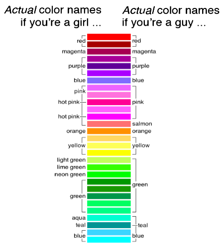
This case is interesting alone. Different populations look at the exact same thing, and report a different label for it.
This variation in opinion can generate problems for a data scientist and a marketing scientist alike.
The idea that objective reality exists, and what you see depends on your own bias, shouldn’t be all that tricky to understand. That two people can see the same thing, and conclude different conclusions, shouldn’t be so controversial.
Now back to analytics.
How do I know that a trend for you is really a trend to me?
Some people see pink. Some people see salmon. And sometimes that difference is all the difference in the world.
***
I’m Christopher Berry.
Follow me @cjpberry
I blog at christopherberry.ca