
The ggplot2 R library
One of the amazing things about R as a programming language is just how many libraries there are. The ggplot2 library is one of them. And, so far, I like it.
- You can download the package here. (You should download the latest version, as version 0.9.1 is quite upgraded from 0.8.9*).
- I’m using data pulled from the EIU Global Growth Forecasts from Buzzdata.
- I used Hadley Wickham’s Had.co.nz site as as reference. (Thank you!)
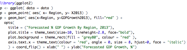
This code:
Reliably generates this chart:

Just a subtle point to make about one-off speed versus repeatability. If the underlining data changes, as forecasts frequently are, this chart can be replicated as quickly as a file can be downloaded and re-ran. A PNG is generated rapidly. This idea of consistent repeatability is a step removed from manual excel manipulation, and, a step down from SaaS.
It occupies the middle ground. It socially scales better than excel, as it is an efficient way to transmit capabilities across a practice. The syntax of ggplot2 is layered, almost like how creatives work with photoshop.
That said, I haven’t learned how to build beautiful visuals like these or these.
What do you think? Is it worth picking up?
[*Mac Users: install.packages(“ggplot2”, dep=TRUE) ; if there is a library missing, copy and paste in the name and repeat, there’s something amiss with the install file]
***
I’m Christopher Berry.
I write at christopherberry.ca