XKCD Visualizes Money
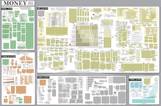
A pretty neat visualization from XKCD caught my eye.
It’s so much chart. Look at the big view.
Wow.
A few points:
- It’s a lot of chart.
- Look familiar? It’s very similar (identical) to the radiation exposure chart.
- It’s great take on a powers of 10 journey…it can be very hard for us to understand huge scales.
***
I’m Christopher Berry.
Follow me @cjpberry
I blog at christopherberry.ca


