
Is hexagon binning really better than scatterplots?
Is hexagon binning really better than scatterplots?
It depends.
Why this topic, why now?
You may have missed Chris Stucchio’s excellent post entitled “Don’t use Scatterplots” on Saturday.
It’s causing quite the ruckus. Naturally. Chris used a provocative title and backed it up with a logical foundation. He showed how hexagon binning generates a more accurate view of reality.
What’s the difference?
This is a scatterplot:

- It has an X axis and a Y axis (and sometimes a Z)
- For every case in the data set, a symbol is used to denote where it is
Chris’ main point is that dots overlap when multiple cases share the same point. Some other commenters have stated that this can be adjusted for by changing some of the settings on the scatterplot.
Most packages allow you to adjust the color / strength through the Z-axis already, but, as you can see in Chris’ example, most people don’t turn it on.
This is hexagon binning:
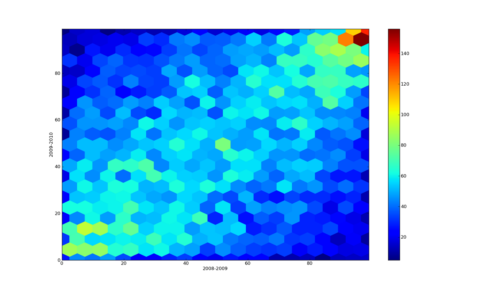
- All the cases in each hexagonal area are summed up and added to the Z-axis (the colors coming out at you!)
How can you do hexagonal binning?
- R (Hexbin package)
- Python (Pandas in Matplotlib)
Is hexagon binning really better?
- If you’re seeking to understand distributions yourself, and want to communicate to other scientists on your team, then they’re great.
- If you’re seeking to communicate to a non-analytical audience and you are presenting in person, then this is a wonderful device – it’s a heatmap – and it’s beautiful! They’re great.
- If you’re seeking to communicate to a non-analytical audience and you are not presenting in person, then avoid these, at least for now.
***
I’m Christopher Berry.
I tweet about analytics @cjpberry
I write at christopherberry.ca