
The Usability of Histograms
A fellow data scientist and I were debating how to answer a very specific question that is asked all the time by others. How would we answer it? I grabbed a piece of paper and drew a histogram.
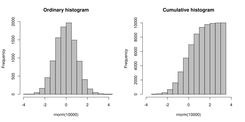
A histogram:
- Plots a single variable along the X-axis.
- Plots the occurrence, or frequency of a given variable along the Y-axis.
- Is used by statisticians and analysts to understand the frequency distribution of a given variable.
I said: “This is how I would want to see the data. This is how I answer the question today. This is what I would want to compare,” Then paused. Reflected. And added, “I am not the end user.”
The end user isn’t a statistician, marketing scientist, or an analyst. Histograms aren’t encountered in everybody’s everyday life. Uncertain if I was being elitist, I turned around and asked twitter what they thought of it. And I got a mixed response.
- Some thought that anybody would be able to understand it.
- Some thought that it required too much mental processing.
- Some thought that everybody should know how to read a histogram.
So, instead, we went about asking about the easiest way to communicate a distillation of what a histogram says. What is it that we see in a histogram that answers the question? How do we subtract all the thinking?
I believe that people should be able to read a histogram. I believe that people would be better off if they had a subset of data expressed to them in the format of a histogram. I believe people would make better decisions.
But those are opinions and unbridled optimism. They’re very normative statements.
I don’t think that histograms are usable from a mass usability perspective because they cause too much thought.
Don’t make me think.
Don’t make them think.
***
I’m Christopher Berry.
I tweet about analytics @cjpberry
I write at christopherberry.ca