
Embedding Cause and Effect into Analytics Communication
I encounter a lot of artifacts of analytics communication: dashboards, ppt decks, and excel files.
You can tell a lot about an organization from such artifacts. You can see sandbagging. You can see staff transfers riddled throughout some of them, and you can sense the ghosts of analysts promoted or churned. You can definitely see the ghosts of EVP’s long gone. You can sometimes make out the intended audience, the originally intended audience, and how incredibly diluted something became over time.
An analytics report is akin to sand on the beach. Sometimes the tide comes in and scrubs away the footprints. Much more frequently those footprints add up, muddle the situation, and then fossilize.
Why it happens and a possible solution follows.
Different people have different conceptual models. Instead of making a choice about which factors matter, and which do not, people ask for data that supports their own mental model. For instance, if you became a Director of eCommerce through the paid media path, you have a very specific way of thinking about profit. If you became that Director by way of CRM, you think extremely differently. You can see how the report would differ between the two. If a company has two directors of eCommerce, you’re going to get data inflation. And a third person, looking in, won’t have any idea what’s going on.
The Leviathan has their own mental model. And they will ask for numbers that reflect that. The troops under the Leviathan will always attempt to assert their belief structure into it.
What’s an analyst to do?
I’ll put forward an idea. How about the analyst produces a piece of communication from which they are the sponsor of?
Going through how I’d want to understand the effectiveness of my company, at the highest level, would be the conceptual model report. I’ve taken a non-creative stab at how I think about the factors.
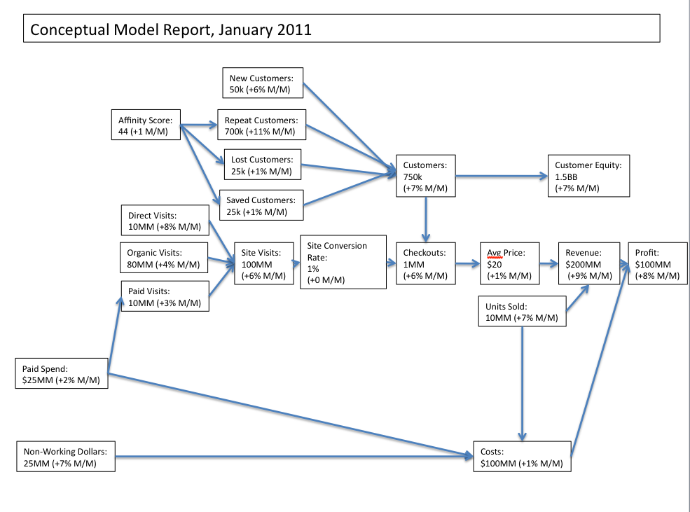
I constructed it by working backwards. The ultimate goal is profit. Profit is the difference between cost and revenue. There are COGS, which I cannot control in this context, and paid spend/non-working dollars, which I could. Then I work backwards again – revenue is average price times number of units sold. I know these figures from the number of checkouts, which is where the second split comes from. Customers place orders. How many customers do I have, how many are new, how many are repeat, how many were lost (from the at-risk category) and how many were saved. A major driver of all that is the affinity score. And so on.
You might say, ‘well what about ____ ?’, isn’t that an important factor? And what about the checkout completion rate? What about my great OOH campaign? And so on. Indeed, there are dozens of factors that I believe are relevant and useful. They’re just not relevant enough to be seen all the time.
There is a lot to be gained by editorializing analytics through selection of what is important, and putting them in context of one another. I use a few ugly arrows to demonstrate causality. Please don’t derp over correlation. I’m pretty certain that an increase in average price and an increase in units sold causes revenue to increase.
The best way I know how to communicate ‘this causes that’ is through an arrow. The market generally doesn’t like it. In Powerpoint, I deliberately lay out charts to infer cause-effect. Four quadrants on a sheet assist in that process. It’s more accepted, but it’s more confusing.
I think it assists the analyst in writing relevant and strong analysis and recommendations. It lends itself especially well to statistical modeling. It also lends itself particularly well to forecasting and scenario analysis.
Reports in this format are less susceptible to moar boar additions. For instance, any new factor to the model will have to be significant enough to matter, and actually have a cause.
The bad news is that there is no trend line. Each of these boxes could be replaced with a box with a sparkline in it. But you can see how it would devolve into a nine page extravaganza. It’s on this point, where regression starts to come in, replete with lag factors, that the real science begins and bull reportage ends.
So how would you build out a report? If you sponsored a report, and it was yours, not the Leviathan’s, what would you put in it? What would you focus on? More importantly, if it was your company, what would you focus on? How would you demonstrate that your course of action was correct? How would you inject cause and effect into analytics communication, and keep the moar boar at bay?
One thought on “Embedding Cause and Effect into Analytics Communication”
Hello,
We facilitate the provision of independent analysis to support expert testimony, regulatory or legislative engagements. Frequently, this work includes economic, financial and statistical studies of varying data analysis, technical and http://www.fidelityadvisory.com.
Comments are closed.